
BRIEF: Organa Health and Wellbeing required a rebrand. Organa wanted to be rebranded away from the health and beauty side and rebranded to the health of the mind, movement, and microbiome of individuals. They have four brand attributes - trust, transparency, discovery and community.
WHAT I DID: Logo | Icon | Website | Packaging | Colour Palette | Mock Up | Animation
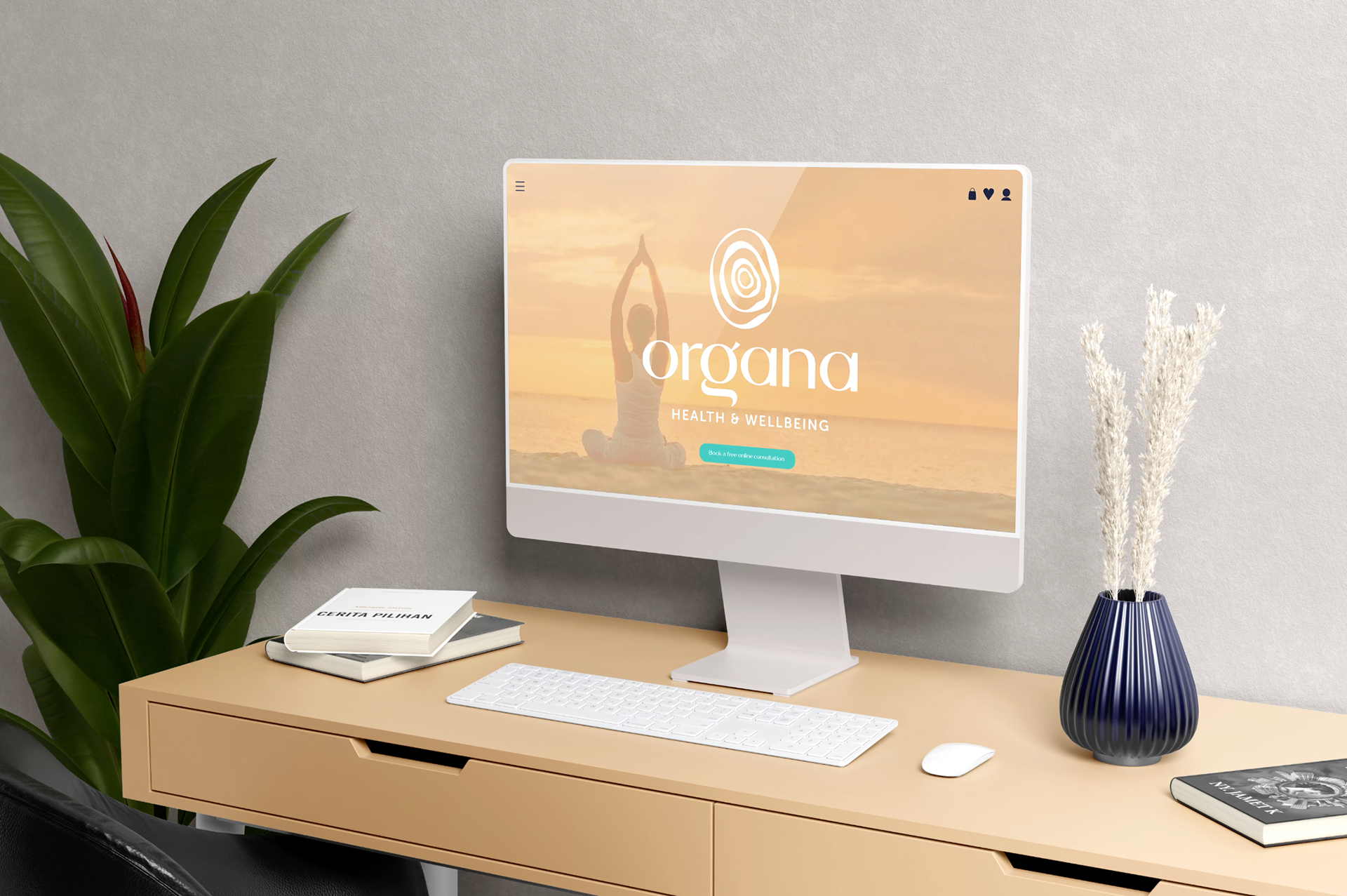
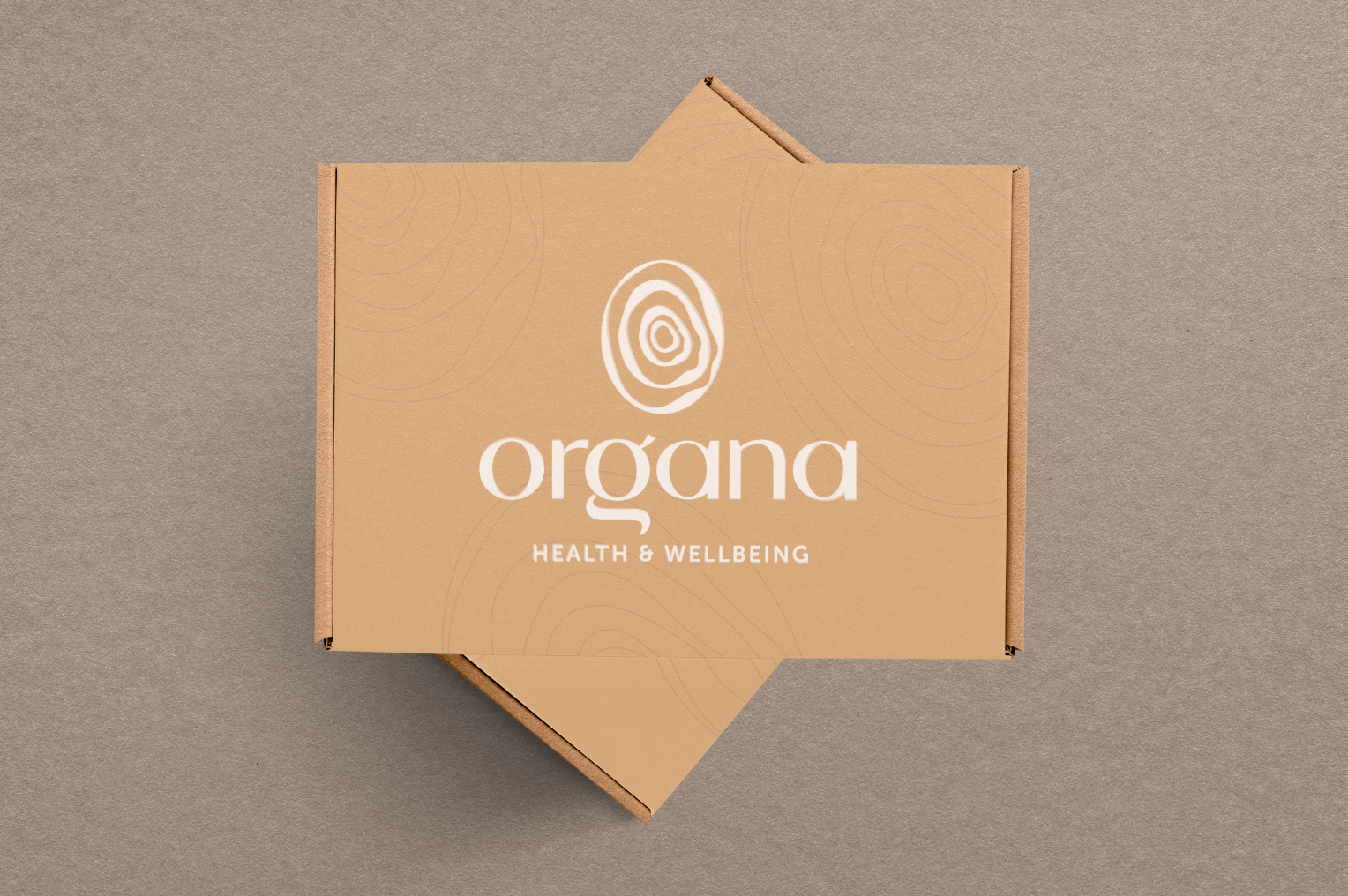
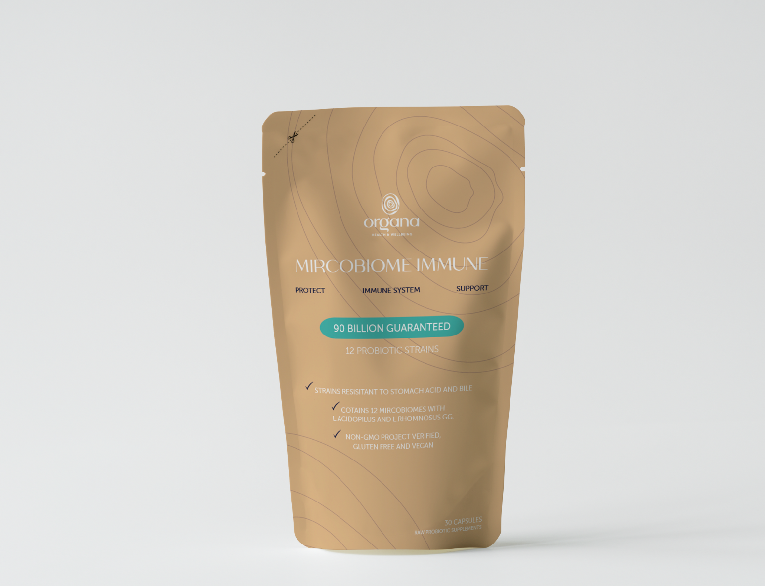
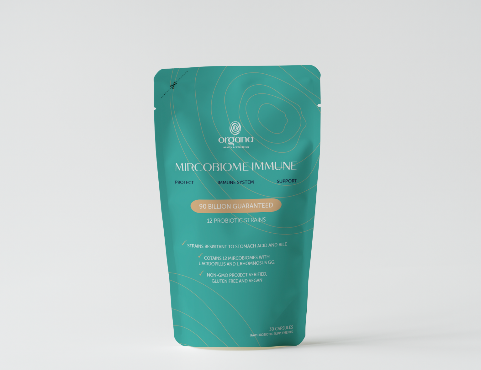
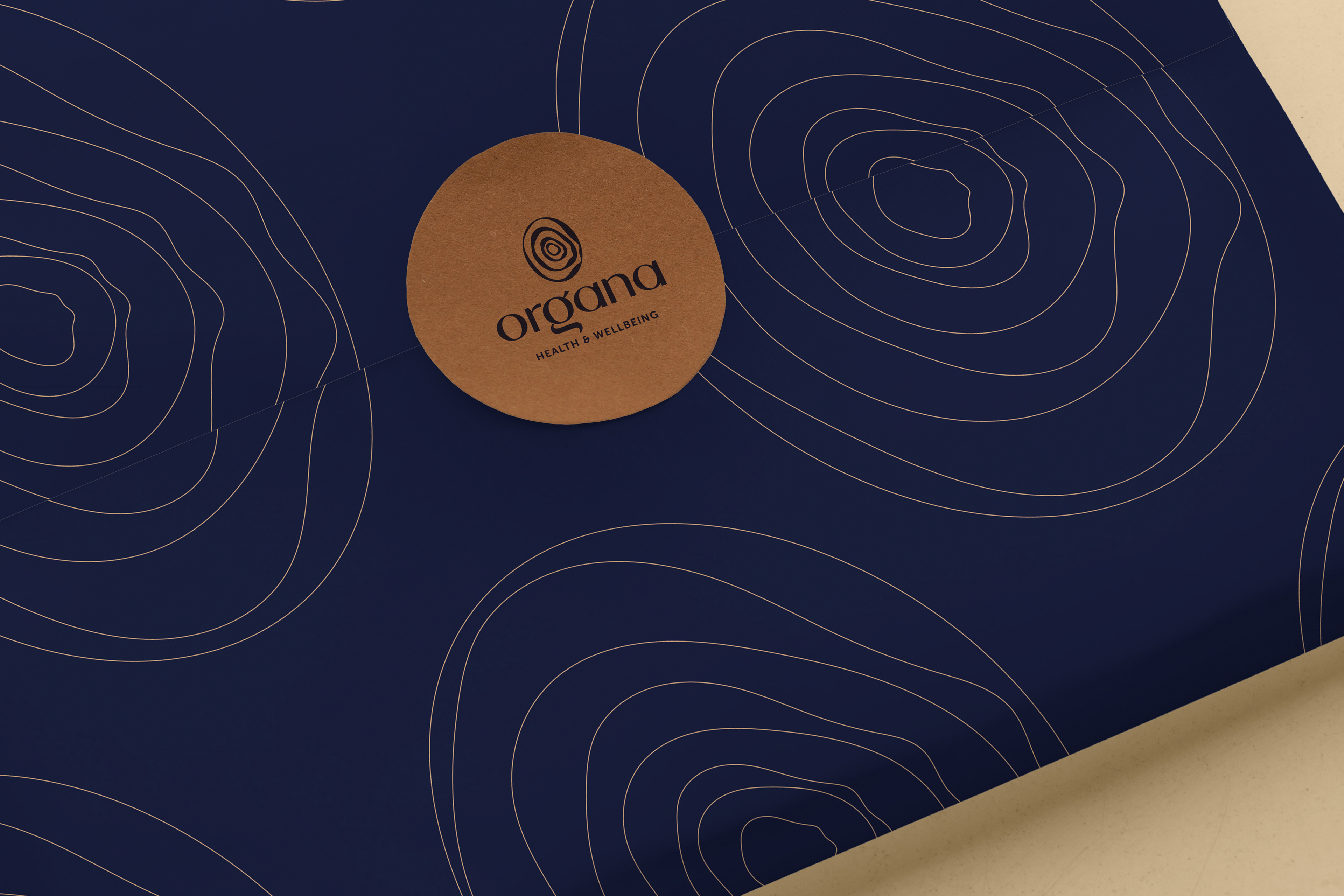
The branding colour choice reflects skin tones, and the blue tones are inspired by the ocean which connotes a calm, relaxed vibe.
Website
WHAT I DID: Colour Palette | Mock Up | Animation | Grid | Image selection | Music selection
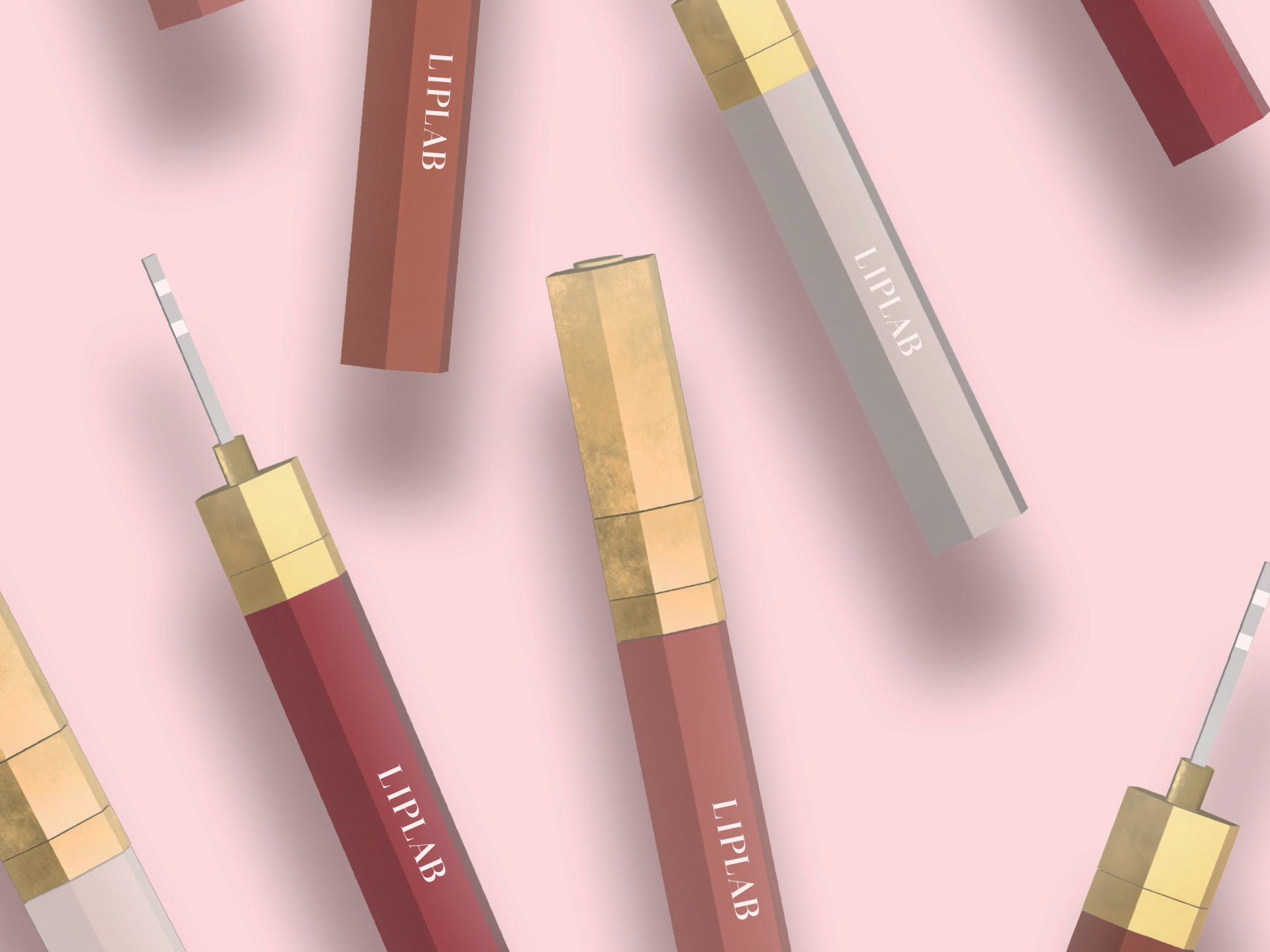
Illustrations | Iconography | Patterns